Purple 5
By @alexcornell // 11.05.12
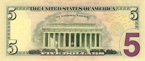
The redesigned five dollar bill was announced in early 2008. It looks like money. Green, complex borders, some words here and there…and a GIANT PURPLE FIVE. Fuck yeah America.

The Purple 5 is awesome. I’m amazed it exists. I’m thrilled it exists. There is even a little cloud of yellow numbers floating around. It’s kind of like catching a glimpse of the Country’s socks and seeing it wears Paul Smith.
Further investigation reveals an predictably boring explanation for its existence:
The numeral 5 in the lower right corner on the back of the bill was enlarged for the redesigned $5 bill and printed in high-contrast purple ink to help those with visual impairments distinguish the denomination.
OK fine, take all the fun out of it. Richard Lawrence Poe really pops my balloon:
The redesign of our currency has nothing to do with fighting counterfeiters or helping people with weak eyesight. It has everything to do with catering to the perverse canons of postmodernist art. The U.S. Treasury has allowed a cabal of avant-garde designers to pull off one of the most audacious practical jokes in art history; the “subversion” and “deconstruction” of the U.S. dollar. We the taxpayers must demand an end to this cultural vandalism.
First, impressive use of “avant-garde designers” and “U.S Treasury” in the same sentence. But second, I the taxpayer demand a continuation of this cultural “vandalism” Poe refers to. I welcome such deviations from the norm. Let’s do it. Bring it on.
I want more purple 5.